
Modern SharePoint branding helps organizations create intranet and site experiences that feel clear, trustworthy, usable, and consistent without over-customizing SharePoint. This guide explains how branding connects to navigation, templates, page governance, accessibility, search, and long-term adoption, and when branding issues should become a broader intranet redesign or governance conversation.
SharePoint branding is no longer about making SharePoint look like a custom website. That old approach usually created more maintenance work than business value.
Modern SharePoint branding works best when it improves clarity, trust, navigation, usability, and content consistency. The goal is not to hide SharePoint. The goal is to make SharePoint feel like a useful, branded workplace that employees can understand quickly.
A strong brand experience helps people know where they are, what matters, and what action to take next. Visual polish matters, but it should never cover up weak structure. In our experience, the best SharePoint sites look professional because the content, navigation, ownership model, and design standards all work together.
Before treating branding as the answer, use the SharePoint Intranet Redesign Readiness Worksheet to test whether your current intranet needs a design refresh, a structural cleanup, or a full rebuild. For broader project support, use SharePoint Intranet Consulting Services. For focused visual design, reusable templates, layout standards, and brand alignment, use SharePoint Branding, UX & Page Template Design.
What this article covers
This article explains:
- What modern SharePoint branding should include
- Why branding should support usability, navigation, content hierarchy, and accessibility
- How page templates, brand assets, hub branding, and governance keep the experience consistent
- How branding affects intranet trust, search quality, content ownership, adoption, and Copilot readiness
- When branding issues should become a design refresh, intranet redesign, page governance effort, or larger SharePoint consulting project
What Is SharePoint Branding?
SharePoint branding is the process of aligning SharePoint sites with your organization’s visual identity, communication style, user experience standards, and governance model.
It includes the logo, but it should never stop there.
Modern SharePoint branding usually includes:
- Site themes
- Brand colors
- Logos and approved imagery
- Navigation standards
- Hub site branding
- Page templates
- Web part layout patterns
- Typography choices
- Icon and image guidance
- Content hierarchy
- Accessibility standards
- Publishing rules
- Page ownership
- Design governance
A branded SharePoint experience should make the environment feel familiar, professional, and trustworthy. It should also make pages easier to read, scan, maintain, and improve.
Here is the practical test: if branding makes SharePoint harder to use, it is not good branding.
Why SharePoint Branding Changed
Older SharePoint branding often depended on classic master pages, custom CSS, page layouts, and deep customization. That approach gave organizations more visual control, but it also created long-term support risk.
Modern SharePoint works differently.
Microsoft’s guidance on modern SharePoint site branding focuses on themes, logos, colors, navigation, hub sites, and site templates instead of classic-era customization patterns. That shift matters because SharePoint Online is responsive, cloud-managed, and updated continuously.
Heavy custom branding can work against that model.
Organizations that keep classic branding habits often run into familiar problems:
- Layouts break after Microsoft updates.
- Mobile experiences feel inconsistent.
- Pages look different across departments.
- Custom code becomes difficult to support.
- Branding decisions bypass governance.
- Hub and site navigation grows confusing.
- Page designs fail to scale across content owners.
A modern SharePoint brand should work with Microsoft 365, not against it.
That does not mean every site must look plain. It means branding needs to be supportable, governed, and useful.
Modern SharePoint Branding Starts with Structure
Branding should not be the first decision. Structure should.
Before choosing colors, banners, icons, or templates, define how the site needs to work. Employees care less about the exact shade of blue than whether they can find policies, tools, forms, files, and news without confusion.
In many SharePoint branding projects, the visual complaints point to deeper issues:
- Navigation is too department-centered.
- Site owners use different page formats.
- Important content has no clear owner.
- News posts mix urgent updates with routine announcements.
- Department sites feel disconnected from the main intranet.
- Search results return duplicates or outdated pages.
- Pages look attractive but use weak headings.
- Employees do not know which page is authoritative.
That is why strong branding connects directly to SharePoint information architecture and metadata. A branded page only works when the structure behind it is clear.
Visual design can improve trust. Structure protects that trust.
SharePoint Branding Is Not Just “Make It Look Better”
Many organizations ask for SharePoint branding because the site feels outdated. That is a valid reason to start the conversation.
Still, “make it look better” is too narrow.
A modern SharePoint branding effort should answer practical questions:
- Who uses this site?
- What tasks do they complete here?
- Which pages must feel authoritative?
- What navigation should remain consistent?
- Which sites need local flexibility?
- What should page owners be allowed to change?
- Which design patterns should be reusable?
- How will the brand support accessibility?
- Who approves new templates and major changes?
- How will stale or off-brand pages be corrected?
These questions matter because SharePoint grows quickly. Without clear standards, every department invents its own design language.
That is when branding turns into noise.
Good branding creates confidence. Poor branding adds another layer of confusion.

The Right Role for Brand Colors, Logos, and Fonts
Brand elements still matter. They help SharePoint feel connected to the organization instead of looking like a generic Microsoft workspace.
Use brand elements to create recognition, not clutter.
A practical SharePoint brand system should define:
- Which logo version appears in site headers
- Which colors are used for themes
- Which accent colors are allowed
- Which images are appropriate for hero areas
- Which fonts are supported
- Which icons can be used
- How much visual variation departments can have
- Where brand assets should be stored
- Who can update approved assets
The SharePoint Brand Center gives organizations a more centralized way to manage brand assets, including colors, fonts, images, and related brand resources. That can help reduce random file sharing and inconsistent image use.
However, a tool does not create discipline by itself.
Brand Center can help manage assets. Governance decides how those assets should be used.
Use SharePoint Themes Carefully
Themes are one of the most practical ways to bring brand identity into modern SharePoint.
A theme can help control colors across sites. It can also make departments feel connected to the broader intranet experience.
Microsoft’s SharePoint site theming guidance explains how administrators can define custom themes and manage which themes are available. That is useful when organizations want consistent branding across many sites.
Even then, themes should stay simple.
Too many themes create confusion. Too much color weakens readability. A heavily branded page can also distract people from the task they came to complete.
Good SharePoint themes usually follow these principles:
- Use brand colors with restraint.
- Keep text contrast accessible.
- Avoid using accent colors for every web part.
- Make links and buttons easy to recognize.
- Reserve strong colors for priority areas.
- Test pages on desktop and mobile.
- Keep department variations limited.
- Document when each theme should be used.
A theme should support the page. It should not become the page.
Hub Site Branding Creates Continuity
Hub sites play an important role in branded SharePoint experiences. They connect related sites through shared navigation, visual identity, and information architecture.
For example, an HR hub might connect benefits, policies, onboarding, learning, and employee resources. A branded hub experience helps employees understand that those sites belong together.
Hub branding is especially useful when organizations want a consistent intranet experience across multiple departments.
A hub can support:
- Shared navigation
- Common brand styling
- Related site grouping
- Department-level flexibility
- Clearer wayfinding
- Better user confidence
- More consistent publishing standards
However, hub branding should not replace planning.
Before branding a hub, define what belongs in the hub. Decide which sites should associate with it. Clarify who owns navigation. Then set expectations for templates, page design, and content review.
For broader intranet planning, connect branding decisions to your SharePoint intranet consulting services strategy so the visual layer supports the full employee experience.
Navigation Is Part of Branding
Navigation is one of the most overlooked parts of SharePoint branding.
A site can look polished and still fail if users cannot understand the menu. Employees experience the brand through the path they take to find information.
Microsoft’s SharePoint navigation planning guidance reinforces an important point: navigation helps users find what they need quickly so they can act, decide, learn, or engage.
In practice, branding and navigation should be planned together.
A strong SharePoint navigation model should:
- Use plain language
- Reflect user tasks
- Avoid internal jargon
- Keep menus shallow
- Separate audience-specific links
- Support hub-level wayfinding
- Avoid duplicate destinations
- Keep global and local navigation distinct
- Review navigation regularly
Navigation is not decoration. It is the user’s map.
When navigation is clear, the site feels more trustworthy. When it is messy, even a well-designed page feels unreliable.
Page Templates Make Branding Scalable
A branded SharePoint experience should not depend on every page owner making design decisions from scratch.
That is where page templates matter.
Templates give content owners a repeatable starting point. They also help users see familiar patterns across pages. This is especially important for intranets, policy centers, department portals, knowledge bases, and executive communication sites.
Useful SharePoint page templates often include:
- Department landing page
- Policy page
- Service page
- News post
- Event recap
- Leadership update
- Knowledge article
- Project summary
- Resource collection
- FAQ page
- Forms and tools landing page
Each template should define more than layout.
A good template should clarify:
- Recommended heading structure
- Required page summary
- Web part placement
- Image use
- Call-to-action placement
- Related links
- Owner information
- Review date expectations
- Metadata requirements
- Publishing approval needs
This is where branding becomes operational.
A template is not just a design shortcut. It is a governance tool.
Branding Needs Page Governance
SharePoint branding breaks down when page owners have no rules.
That does not mean every page needs strict approval. It means important pages need standards.
A modern branding model should define how pages are created, reviewed, updated, and retired. This protects the experience after launch.
We have seen this pattern many times. A company launches a polished intranet homepage. Six months later, department pages look inconsistent. Old announcements still appear in search. New pages use random banners. Some content owners copy outdated pages because no approved template exists.
That is design drift.
The fix is not always another redesign. Often, the fix is SharePoint page governance.
Page governance should define:
- Who can create pages
- Who approves important pages
- Which templates are required
- Which pages need review dates
- How stale pages are identified
- When news posts should expire
- How page ownership is tracked
- What happens when content owners leave
- How off-brand pages are corrected
- Which design patterns are mandatory
Brand consistency depends on operating discipline. Without it, even a strong launch will fade.
Use Approved Brand Assets
SharePoint pages often suffer from inconsistent image use.
One department uses stock photos. Another uses screenshots. A third uploads stretched logos. Someone else adds low-quality icons from the web.
That inconsistency weakens the user experience.
An organization asset library can help solve this problem. Microsoft’s guidance on organization asset libraries explains how approved images, logos, and Office templates can be made available to users from a central location.
That matters because content owners need easy access to the right assets.
A practical brand asset model should include:
- Approved logos
- Department-safe image sets
- Leadership headshots
- Icon libraries
- Page banner images
- Intranet-specific illustrations
- Office templates
- Photography standards
- Image sizing guidance
- Alt text expectations
Do not make users hunt for brand assets. They will use whatever is easiest.
If the approved path is harder than the wrong path, the wrong path wins.
Accessibility Is a Branding Requirement
Branding should never reduce accessibility.
Colors, contrast, headings, links, images, and layout choices all affect how employees experience SharePoint. This includes employees using assistive technology, mobile devices, older monitors, or low-bandwidth environments.
Accessibility is not a compliance afterthought. It is part of design quality.
A SharePoint branding standard should address:
- Color contrast
- Link visibility
- Heading order
- Alt text
- Button clarity
- Font readability
- Image-heavy pages
- Mobile layouts
- Table usage
- Video captions
- Page scanning behavior
At dataBridge, we treat accessibility as a practical usability issue. A page that is hard to read will not be adopted just because it looks attractive.
Clear wins over clever.
Content Hierarchy Shapes the Brand Experience
A branded SharePoint page should make the user’s next step obvious.
That depends on content hierarchy.
Good hierarchy tells users what matters first, what supports it, and where to go next. Poor hierarchy creates long pages that look polished but feel hard to use.
Use these patterns to improve hierarchy:
- Start with a clear H1.
- Add a short page summary.
- Use H2 headings for major topics.
- Keep paragraphs brief.
- Break up long lists.
- Use cards for grouped resources.
- Reserve hero areas for high-value content.
- Place calls to action near decision points.
- Add related links where they help.
- Avoid turning every sentence into a link.
The best SharePoint pages feel calm. They do not make users work to understand the layout.
This is especially important for employee portals, policy pages, onboarding content, and executive updates.
Avoid Over-Branding SharePoint
Over-branding is one of the fastest ways to weaken SharePoint.
Some organizations try to make SharePoint look unlike SharePoint. That usually creates more problems than it solves.
Common over-branding mistakes include:
- Too many custom colors
- Large decorative banners on every page
- Icons that do not explain anything
- Custom CSS used without long-term support
- Image-heavy pages that load slowly
- Department designs with no shared pattern
- Promotional layouts for operational content
- Homepages that look good but hide key tasks
- Design choices that make mobile use harder
SharePoint does not need to disappear behind the brand. It needs to feel like a trusted, branded workplace tool.
The goal is not to defeat the Microsoft 365 experience. The goal is to guide it.
When Custom Development Makes Sense
Modern SharePoint branding should avoid unnecessary custom code. However, some scenarios still need thoughtful development.
Custom development may make sense when an organization needs:
- A reusable SharePoint Framework component
- A custom header or footer experience
- A specialized web part
- A governed page component
- A branded dashboard pattern
- A controlled form or workflow experience
- Integration with business systems
- A custom navigation or content display pattern
The key word is supportable.
Custom work should have a business reason, a governance model, and a lifecycle plan. Otherwise, it becomes another thing the organization must maintain.
For deeper customization needs, connect branding decisions to SharePoint development and customization services. That keeps design, governance, and supportability aligned.
Branding and Intranet Redesign Are Not the Same
Sometimes a site needs branding. Other times, it needs a redesign.
The difference matters.
Branding improves the visual and experience layer. Redesign addresses the broader operating model behind the site.
A SharePoint intranet redesign may include:
- Current-state assessment
- Navigation restructuring
- Content inventory
- Site architecture changes
- Hub model refinement
- Page template redesign
- Governance updates
- Search improvement
- Ownership cleanup
- Launch planning
- Adoption support
If users say the intranet looks old but the real problem is findability, branding alone will not fix it.
When the issue is broader than visual consistency, SharePoint intranet redesign services may be the better path because they address structure, content, ownership, governance, and relaunch planning together.
A new look can help. A better operating model lasts longer.
Branding Should Support Search
Search is part of the SharePoint experience, even though many branding projects ignore it.
Users do not always browse. They search for policies, forms, procedures, people, departments, templates, and project resources.
Branding can help search when pages are structured well.
Good branding supports search through:
- Clear page titles
- Descriptive headings
- Consistent page templates
- Useful summaries
- Meaningful metadata
- Updated owner information
- Related links
- Reduced duplicate pages
- Clean naming standards
- Retired stale content
A beautiful page with a vague title is still hard to find.
For organizations struggling with inconsistent results, SharePoint search governance should sit alongside branding and page governance. Search quality depends on structure, content, and ownership.
Branding Also Matters for Copilot Readiness
Branding does not make SharePoint ready for Microsoft 365 Copilot by itself.
Still, it can support readiness when it creates clearer pages, stronger ownership, better templates, and more trusted content patterns.
Copilot works better when SharePoint content is organized, governed, permission-aware, and authoritative. A branded but messy environment still creates risk. Attractive pages do not solve duplicate content, unclear ownership, or oversharing.
A practical branding effort can help by reinforcing:
- Authoritative pages
- Clear page titles
- Strong summaries
- Trusted resource collections
- Consistent ownership
- Review dates
- Better content structure
- Cleaner navigation
- Less duplicate publishing
That is why branding should connect to Copilot-ready SharePoint information architecture instead of sitting in a visual design silo.
AI rewards clarity. Employees do too.
A Practical SharePoint Branding Framework
A modern SharePoint branding effort should follow a structured path.
The sequence matters. If you start with visuals and work backward, you may improve the look without solving the experience. If you start with users, structure, and governance, the visual layer has a much stronger foundation.
Here is a practical framework.
1. Assess the Current Experience
Start with the existing SharePoint environment.
Review:
- Top-level sites
- Department sites
- Hub sites
- Navigation
- Page templates
- Branding patterns
- Image use
- Search behavior
- Page ownership
- Mobile experience
- Accessibility issues
- Content quality
- Governance gaps
This step often reveals that the brand problem is partly a structure problem.
That is not bad news. It gives the project a clearer starting point.
2. Define the Brand Experience Goals
Next, define what the branded experience should accomplish.
Goals may include:
- Make the intranet feel more professional.
- Improve confidence in official content.
- Create consistency across departments.
- Support executive communication.
- Improve employee self-service.
- Reduce page design variation.
- Strengthen mobile readability.
- Support a future intranet redesign.
- Prepare content for Copilot and AI use.
Good goals are practical. They describe how the site should work, not only how it should look.
3. Build the Design System
A SharePoint design system gives page owners shared rules.
It should define:
- Approved themes
- Logo placement
- Color usage
- Image standards
- Hero area rules
- Web part patterns
- Page template options
- Link treatment
- Heading structure
- CTA placement
- Related content patterns
- Accessibility expectations
Do not make the system too complex.
The best SharePoint design systems are simple enough for real content owners to follow.
4. Create Reusable Templates
Templates turn branding into repeatable practice.
Build templates for the page types that matter most. Then document when to use each one.
For example:
- Use a department landing page template for major business units.
- Use a policy page template for official policies.
- Use a service page template for internal service teams.
- Use a news template for announcements.
- Use a resource hub template for grouped links and documents.
Reusable templates reduce decision fatigue. They also protect consistency after launch.
5. Align Branding with Governance
A brand standard needs an ownership model.
Define who owns:
- Brand assets
- Themes
- Templates
- Navigation
- Hub standards
- Department page quality
- Publishing rules
- Review cadence
- Accessibility checks
- Search quality
- Template changes
Without ownership, branding becomes a launch event. With ownership, it becomes a managed experience.
6. Test with Real Users
Do not rely only on internal project feedback.
Test the branded experience with people who will use the site. Give them real tasks.
Ask them to find:
- A policy
- A form
- A department resource
- A leadership update
- A benefits page
- A training item
- A project document
- A key contact
Then observe what happens.
If users struggle, the design still needs work.
A site that looks good in a meeting may not work well on a Monday morning.
7. Launch with Standards and Support
A successful launch should include more than new pages.
It should include:
- Page owner guidance
- Template instructions
- Brand asset access
- Navigation ownership
- Publishing expectations
- Review cadence
- Governance checkpoints
- Training for content owners
- A process for changes
This is where many branding projects fall short. They launch the design but forget the people who must maintain it.
The result is predictable. The site slowly drifts.
SharePoint Branding Checklist
Use this checklist before updating your SharePoint brand.
Brand Foundation
- Approved logo versions are documented.
- Brand colors are mapped to SharePoint themes.
- Font decisions are realistic for Microsoft 365.
- Approved images and icons are stored centrally.
- Brand asset ownership is clear.
- Department-level variation is defined.
User Experience
- Navigation uses employee-friendly language.
- Page layouts support scanning.
- Templates exist for common page types.
- Important calls to action are easy to find.
- Pages work well on mobile devices.
- Accessibility standards are included.
Governance
- Page owners are assigned.
- Templates have usage rules.
- Navigation has an owner.
- Review dates are defined.
- Stale pages have a retirement process.
- Off-brand pages have a correction path.
Search and AI Readiness
- Page titles are clear.
- Headings match user intent.
- Metadata supports findability.
- Duplicate pages are reduced.
- Authoritative content is identified.
- Permissions are reviewed where needed.
Long-Term Management
- Brand standards are documented.
- Site owners know what they can change.
- Design changes require review.
- New templates have an approval path.
- Analytics inform future improvements.
- Governance reviews happen on a set cadence.
Common SharePoint Branding Mistakes
SharePoint branding usually fails for predictable reasons.
Here are the mistakes we see most often.
Mistake 1: Starting with Colors Instead of Use Cases
Colors matter, but use cases matter more.
Before choosing visual treatments, define what employees need to do. A page for policies should not behave like a marketing landing page. A department hub should not feel like a document dumping ground.
Design follows purpose.
Mistake 2: Recreating a Public Website Inside SharePoint
SharePoint is an internal work platform.
It should feel polished, but it should not copy every pattern from the public website. Employees need fast access to content, tools, people, and decisions.
A public website sells. An intranet helps people work.
Mistake 3: Giving Every Department Full Design Freedom
Department flexibility sounds good until every site feels unrelated.
Set boundaries early. Allow departments to tailor content and imagery, but keep navigation, templates, accessibility, and page hierarchy consistent.
Consistency helps users move across the intranet with confidence.
Mistake 4: Ignoring Mobile Experience
Modern SharePoint pages are responsive, but that does not guarantee every design choice works well on mobile.
Large images, complex sections, wide tables, and crowded quick link layouts can create mobile friction.
Test pages on real devices before launch.
Mistake 5: Treating Templates as Optional
Templates only help when people use them.
If content owners can ignore templates without consequence, the design system will weaken quickly. Keep templates practical, but make expectations clear.
The best template is the one people will actually use.
Mistake 6: Forgetting About Search
Search exposes weak page structure.
If page titles are vague, metadata is missing, and duplicate content remains online, branding will not solve findability. Build search quality into the design model from the start.
Mistake 7: Launching Without Ownership
Every branded SharePoint environment needs owners.
Someone must manage assets. Someone must review templates. Someone must maintain navigation. Someone must monitor page quality.
Without ownership, the brand becomes a screenshot of what the site looked like on launch day.
How dataBridge Approaches SharePoint Branding
dataBridge approaches SharePoint branding through the same structure-first lens we use across SharePoint consulting.
We do not treat branding as surface decoration. We connect it to usability, governance, intranet architecture, content ownership, and long-term maintainability.
That approach reflects The dataBridge Way: assess the current environment, define the right structure, design the experience, implement with care, support adoption, and improve over time.
Our SharePoint branding work often includes:
- Current-state review
- Brand and UX planning
- Hub and site structure review
- Navigation recommendations
- Page template design
- Theme guidance
- Image and asset standards
- Accessibility review
- Page governance alignment
- Content owner guidance
- Launch support
- Continuous improvement planning
After more than 20 years of SharePoint consulting, we have learned one lesson repeatedly: users trust SharePoint when it feels organized, current, and purposeful.
Branding helps. Governance keeps it true.
When to Update Your SharePoint Branding
You may need to update your SharePoint branding if employees describe the site as outdated, inconsistent, hard to trust, or difficult to navigate.
Common signs include:
- Department pages look unrelated.
- Site owners use different layouts.
- The homepage feels crowded.
- Navigation labels confuse users.
- Important pages are hard to find.
- Mobile pages feel awkward.
- Old images and banners remain in use.
- Employees question which content is official.
- New pages do not follow a standard.
- Search results show stale or duplicate pages.
- Leadership wants a more professional experience.
- The organization is preparing for Copilot or AI tools.
These signs do not always mean you need a full redesign. Sometimes a focused branding and template effort is enough.
However, if the problems involve structure, search, ownership, governance, and adoption, the project should be broader.
What a Strong SharePoint Brand Experience Looks Like
A strong SharePoint brand experience feels clear, useful, and consistent.
Users should notice the organization’s identity without being distracted by it. Site owners should have enough guidance to create good pages without reinventing the design. Leaders should trust that official content appears professional and current.
The strongest environments usually share these traits:
- Navigation feels predictable.
- Pages have clear summaries.
- Brand colors are used with restraint.
- Templates make content easier to publish.
- Department sites feel connected.
- Images look professional and approved.
- Important content has owners.
- Search results feel more trustworthy.
- Mobile pages remain readable.
- Governance keeps the experience stable.
That is what modern SharePoint branding should deliver.
Not decoration. Direction.
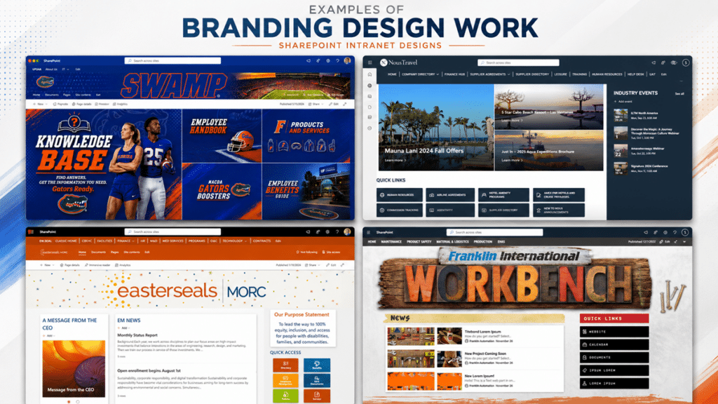
Branding work becomes more effective when it is tied to the way employees actually use SharePoint. These examples show how intranet design can reflect each organization’s identity while still supporting navigation, content discovery, announcements, events, and employee self-service.
Ready to Improve Your SharePoint Branding?
If your SharePoint environment feels outdated, inconsistent, or hard for employees to trust, branding may be part of the answer.
The right approach starts with structure, usability, templates, governance, and long-term ownership. Once those pieces are clear, visual branding becomes much more effective.
dataBridge helps organizations create SharePoint experiences that look professional, work clearly, and remain manageable after launch. To discuss your SharePoint branding, UX, templates, or intranet design needs, contact dataBridge.
SharePoint Branding FAQs
What is SharePoint branding?
SharePoint branding is the process of aligning SharePoint sites with an organization’s visual identity, user experience standards, navigation model, page templates, content hierarchy, and governance rules. Modern branding includes logos and colors, but it also includes usability, accessibility, templates, and ownership.
Is SharePoint branding still possible in modern SharePoint?
Yes. Modern SharePoint supports branding through site themes, logos, colors, navigation, hub branding, page templates, organization assets, and the SharePoint Brand Center. The modern approach avoids many classic-era methods, such as heavy master page customization and unsupported CSS changes.
Should we use custom CSS for SharePoint branding?
Use custom CSS cautiously. Modern SharePoint is designed around supported branding options such as themes, templates, web parts, hub sites, and SharePoint Framework components. Unsupported visual overrides can create maintenance problems when Microsoft updates the platform.
What is the difference between SharePoint branding and SharePoint design?
Branding focuses on identity, consistency, and visual standards. SharePoint design is broader. It includes user experience, navigation, page structure, templates, content hierarchy, accessibility, and governance. The two should work together.
Does SharePoint branding improve adoption?
It can, but only when branding improves clarity and usability. Employees are more likely to use SharePoint when pages feel professional, consistent, current, and easy to navigate. Visual updates alone rarely fix adoption issues.
How do SharePoint page templates support branding?
Page templates make branding repeatable. They give content owners approved layouts, web part patterns, heading structures, and publishing expectations. This helps prevent design drift as new pages are created.
What is the SharePoint Brand Center?
The SharePoint Brand Center is a Microsoft 365 capability for managing organizational brand assets, including colors, fonts, images, and related resources. It helps organizations centralize brand management and reduce inconsistent asset use.
When should SharePoint branding become a full intranet redesign?
Branding may be enough when the main issue is visual consistency. A full intranet redesign is usually better when users struggle with navigation, search, ownership, outdated content, page quality, governance, or adoption.
Related SharePoint Branding and Intranet Resources
- SharePoint Branding, UX & Page Template Design
- SharePoint Intranet Consulting Services
- SharePoint Intranet Redesign Services
- SharePoint Page Governance
- SharePoint Information Architecture & Metadata
- SharePoint Search Governance
- SharePoint Development and Customization Services
- Copilot-Ready SharePoint Information Architecture
Reviewed By

Author
-

Katie leads SharePoint design and branding work at dataBridge, helping organizations create environments that feel polished, intuitive, and useful. Her background in design, administration, and user-focused SharePoint development allows her to improve both the visual experience and the structure behind it.