One of the six designs in this post has 21 buttons on its home page that lead to outside systems. It is the plainest design of the group. It is also built the way the long-lived intranets are built, because after 20 years of designing these, the pattern we see is consistent: the intranets still opened every morning two years after launch put the employee’s daily tools and links at the top of the page, and branding plays a supporting role.
Most galleries of SharePoint intranet examples show launch-day screenshots and stop there. This one shows four home pages and two department pages from dataBridge projects and demo environments, explains what each was designed to do, and points out the parts worth copying. Every design here was built in SharePoint Online inside Microsoft 365, without an intranet product layered on top.
If you want the build process itself, that lives in our complete guide to building a modern SharePoint intranet. This post is about what good looks like.
What Makes a Good SharePoint Intranet Example?
A good SharePoint intranet example is one employees would still open on an ordinary Tuesday, long after the launch email. In our experience that comes down to where the daily tools sit. When the systems and links people need for their job are the first thing on the page, the intranet becomes the way into the workday. When they’re buried under a banner and a welcome message, people bookmark the tools directly and stop visiting.
So when you look at any example, including the ones below, check four things:
- Where the daily tools sit relative to the banner
- Whether news is sorted for the reader or published as one long feed
- How fast an employee can reach help
- What the department pages look like one click in
Design still matters. A strong visual identity gets an intranet opened in the first month, and it tells employees the company invested in them. It just can’t be the only reason to visit.
SharePoint Intranet Home Page Examples
The home page has two jobs: get employees to the tools they use every day, and tell them what changed since yesterday. The four examples below strike that balance differently, from a link-heavy page for clinical staff to a fully themed design for a university athletics department.
Nonprofit health services: daily tools first
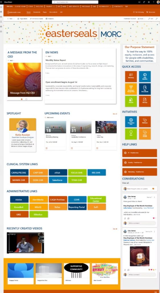
This is the page with the 21 outside-system buttons. They sit in two labeled groups, nine clinical systems and twelve administrative ones, so a clinician and a finance analyst each find their own row without reading the other’s. Above them are six quick access tiles for the directory, benefits, policies and key documents, and the right rail sends help requests to the correct service desk by function.
The branding is present and restrained: a logo banner and the organization’s purpose statement. A CEO message and a news column hold the top left, and a conversation feed on the right gives employees a place to recognize each other.
The lesson here is grouping. Links are organized by who uses them and labeled in plain words, and the page is allowed to be long because every link on it is one somebody needs.
Travel company: news sorted by line of business
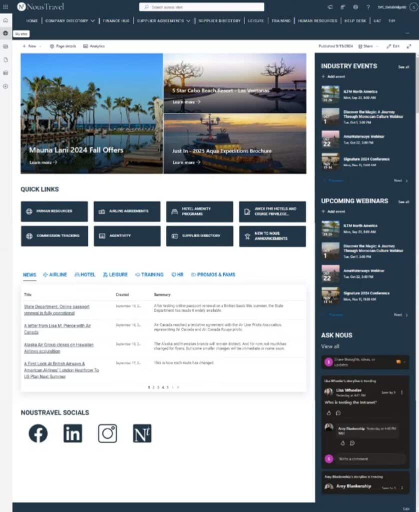
This home page opens with three supplier promotions, which is the news that company’s agents care about most. Below that are eight quick links to the things agents look up during a client call, such as airline agreements, hotel amenity programs, commission tracking and the supplier directory.
The detail worth copying is the news list. It is tabbed by line of business, so an agent who sells leisure travel clicks one tab and skips everything else. Most intranets publish a single feed and hope employees scroll. The right rail carries industry events and webinars, with a question feed below where employees ask each other for answers.
Sort news the way your employees sort their own work, and they’ll read more of it.
University athletics: brand at full volume
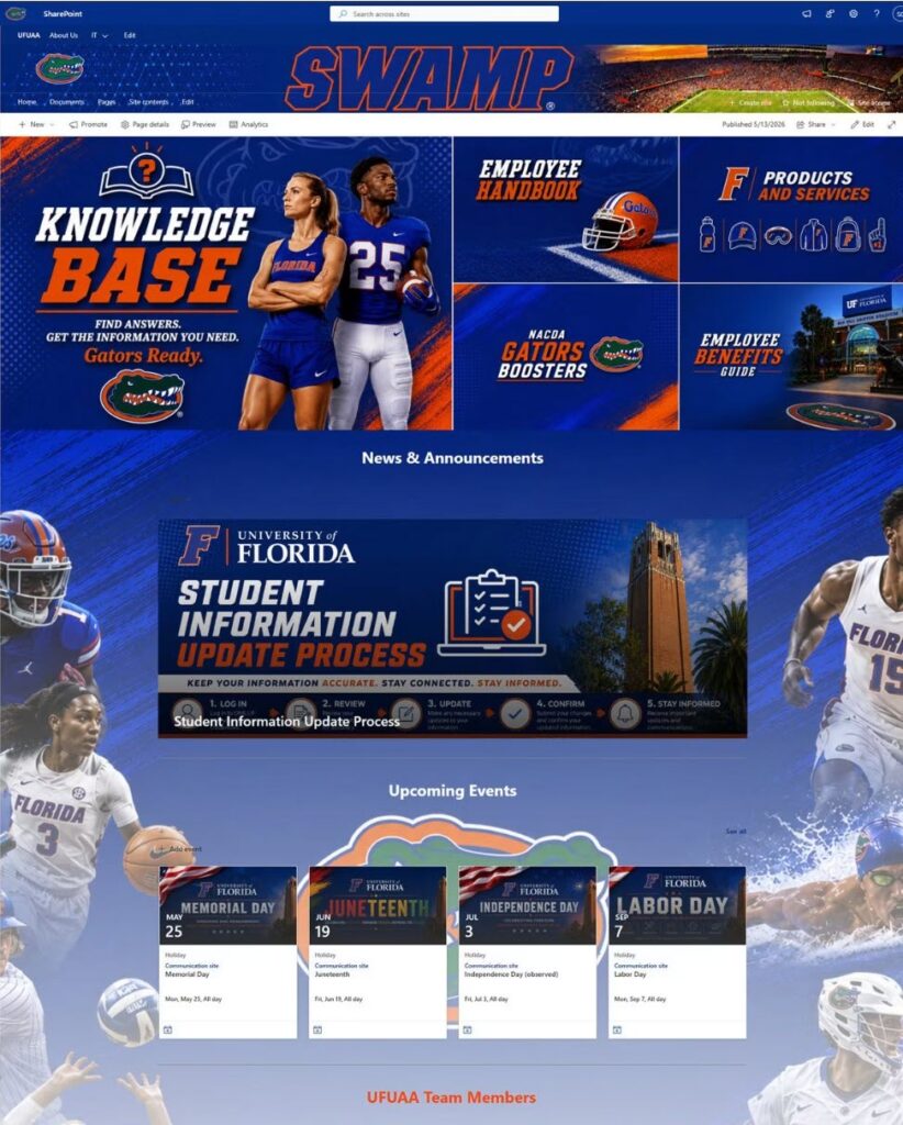
This is the loudest design in the post, and it suits the organization. An athletics department lives on its brand, and an intranet that looked like a generic template would have felt wrong to everyone who works there.
Look past the imagery and the structure follows the same rule as the plainer pages. All five hero tiles are resources: the knowledge base, the employee handbook, the benefits guide, products and services, and the booster program. None of them is a slogan. Further down, a row of icons leads to tools like the employee portal and staff ticket requests, and the page closes with people search next to a recognition form.
If brand is a big part of your culture, turn it all the way up. Just make sure every large tile still leads somewhere useful.
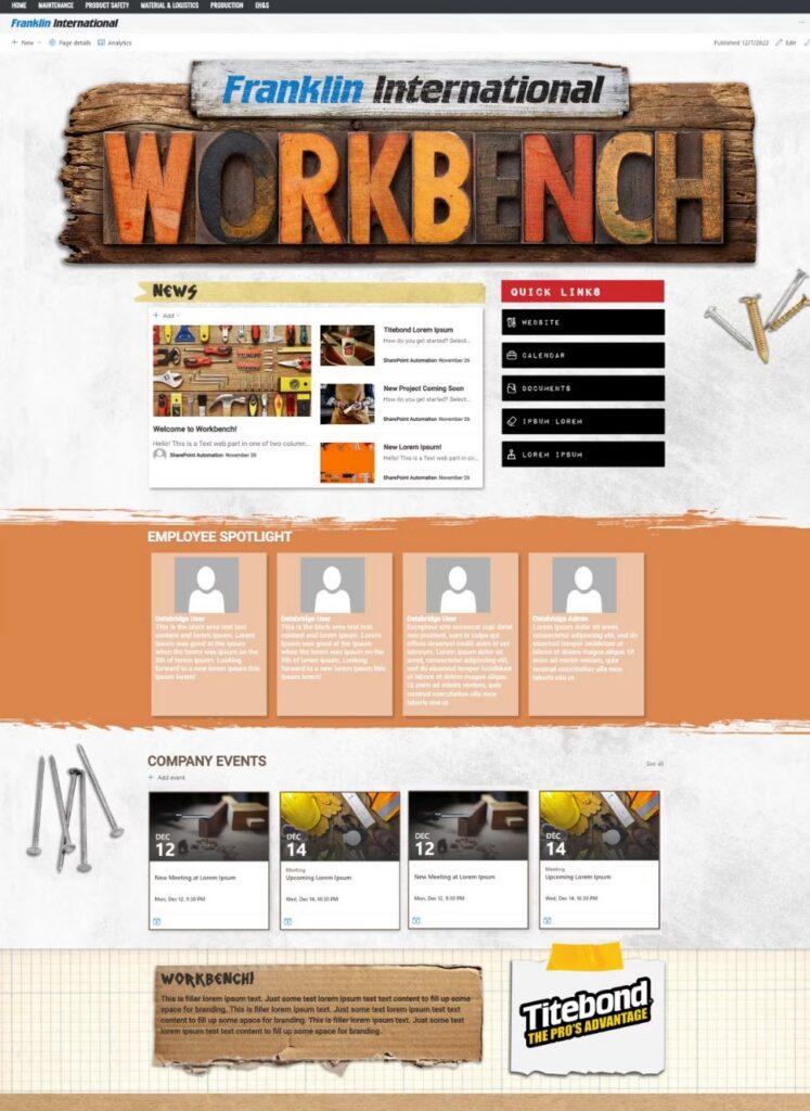
Manufacturer: a themed design concept
This one is a design concept with placeholder content, shown here for the theme. The workbench banner and stenciled headings give a manufacturing workforce an intranet that looks like their world and not like a corporate memo. The top navigation mirrors how the plant is organized: maintenance, product safety, material and logistics, production, EH&S.
A concept like this is the fun part of a project. The work that decides whether it lasts comes next, when the five placeholder quick links get replaced with the real systems people on the floor and in the office open every day. A theme built around the employees’ world still has to pass the same tools-first test as any other page.
SharePoint Department Site Examples
Department pages are where an intranet earns repeat visits, because employees arrive there with a specific question. A good one answers the questions that department gets asked most, without making anyone open a ticket or send an email. These two examples show an HR page built around the documents employees ask for and a culture hub built entirely from standard web parts.
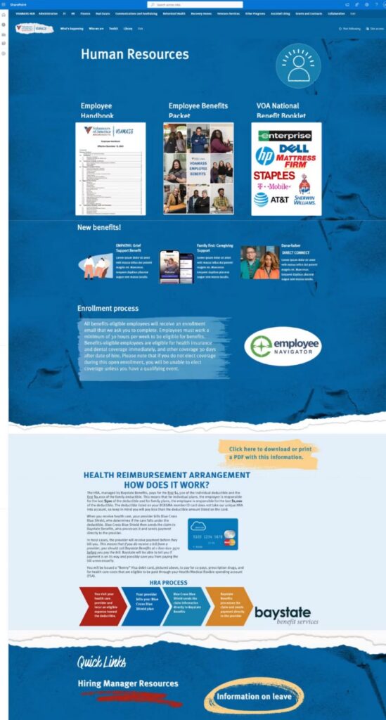
HR page for a human services nonprofit
The top of this page is a row of document covers, starting with the employee handbook and the benefits packet. Those are the files HR gets asked for constantly, so they get the best position on the page. Below them, new benefits get short announcements, and the enrollment process is explained in a few plain sentences with a link to the enrollment system.
The way to build a page like this is to ask each department what they email out most often. That list goes at the top.
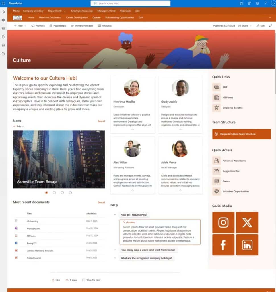
Culture hub built with standard web parts
This page comes from a dataBridge demo environment, and it’s here to make a point about cost. Everything on it ships with SharePoint: the hero banner, news, people cards, a recent documents list, a collapsible FAQ, quick links. There is no custom development and no custom artwork beyond one banner illustration.
Plenty of organizations assume a useful department page needs a design budget. It needs a clear owner more than it needs a designer. Start department pages with standard web parts and spend the design money on the home page, where every employee sees it.
What These SharePoint Intranet Examples Have in Common
Across six organizations and six visual styles, the same structure shows up: tools high on the page, news sorted for the reader, people made visible, and help one click away. The visual treatment ranges from nearly none to stadium-sized, and the structure underneath barely changes.
Two more things don’t show up in a screenshot. In our projects every section of a home page gets a named owner who is responsible for keeping it current, which is the subject of our post on SharePoint page governance. And each home page sits on a planned site structure, so the navigation still makes sense when the company adds a department. If the difference between those building blocks is fuzzy, this comparison of home sites, hub sites and Viva Connections sorts it out.
Why Good-Looking SharePoint Intranets Go Quiet
They go quiet when the home page was designed for launch day and nobody designed it for the hundreds of ordinary days after. The pattern is the mirror image of the examples above. Branding and a welcome message fill the first screen, and the tools employees need are two scrolls down or missing.
Employees are practical. Once they learn the intranet is slower than a browser bookmark, they bookmark the tools and the visits stop. Leadership sees the traffic drop and orders a new look. A new look on the same structure goes quiet the same way.
If that sounds familiar, the fix is usually a restructure around tasks, which is what our SharePoint intranet redesign services are built for. The habits that keep a relaunch from fading are covered on the intranet adoption strategy page.
Do You Need an Intranet Product to Get These Designs?
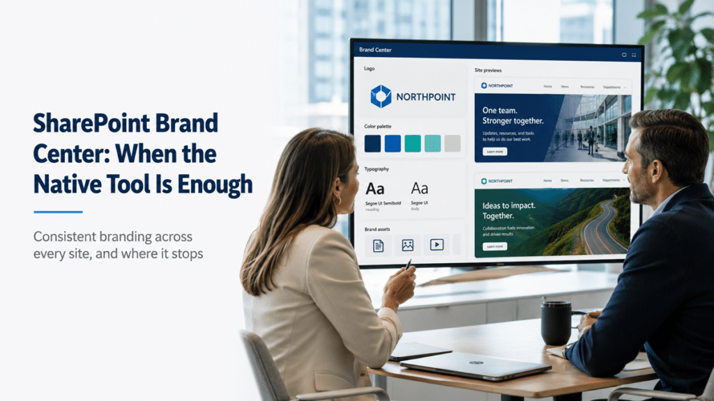
No. Every example in this post was built in SharePoint Online with the tools included in Microsoft 365. Section backgrounds, custom imagery, standard web parts, and themed fonts and colors through the SharePoint brand center cover far more ground than most buyers expect.
Intranet-in-a-box products have a place, mostly for smaller companies with no SharePoint administrator, and we lay out that math in SharePoint intranet vs intranet-in-a-box platforms. For larger organizations, a native build usually costs less over time and leaves you with nothing to renew.
How to Use These Examples for Your Own Intranet
Use them as a checklist for structure before you use them as inspiration for style. Start with a list, and leave the mood board for later.
- Write down the systems and links your employees open every day, by role
- Open your current home page and cover the banner with your hand – if what’s left isn’t useful, the structure needs work before the design does
- Pick the example above that is closest to your workforce and note what sits in its first screen
- Ask each department what they send by email most often, since that list is the first draft of their page
Then look at more designs. Our SharePoint design portfolio has dozens across industries, and the SharePoint intranet by industry pages explain how requirements shift between, say, healthcare and construction.
When you want a second opinion on your own site, a SharePoint intranet assessment reviews your current structure against these same criteria, and the Intranet ROI Calculator puts a number on what poor findability costs you today. Or skip ahead and tell us what you’re working on.
Frequently Asked Questions
Can a SharePoint intranet really look like these examples?
Yes. All six are SharePoint Online pages, and you can see the Microsoft 365 suite bar at the top of most of the screenshots. Modern SharePoint supports full-width sections, background images, custom themes and brand fonts. What holds most intranets back is design skill and planning time. The platform can do it.
What should be on a SharePoint intranet home page?
The tools employees use daily, news sorted by audience, a way to find people, and a fast route to help. Put the tools first. Leadership messages and culture content belong on the page too, below the things people came for.
How many links is too many for an intranet home page?
There’s no fixed number. The health services example carries 21 outside-system links plus 13 tiles and stays easy to scan, because everything is grouped under plain headings by who uses it. Ten unlabeled links in a single row are harder to use than thirty that are grouped well.
Are these SharePoint intranet templates I can download?
No. Each was designed for a specific organization. Microsoft offers free starter templates for SharePoint, and they’re a reasonable starting point for a small company. For a larger organization the template is the easy part. The decisions about structure and ownership are where the project succeeds or stalls.
How much does a SharePoint intranet like these cost?
Cost is driven by scope far more than by looks. A themed home page adds less than most people expect, and the number of sites and the amount of content to move add more. We walk through the drivers in how much a SharePoint intranet costs.
Reviewed By

Author
-
Katie leads SharePoint design and branding work at dataBridge, helping organizations create environments that feel polished, intuitive, and useful. Her background in design, administration, and user-focused SharePoint development allows her to improve both the visual experience and the structure behind it.